A flexible brand identity for a net zero consortium

The Challenge
This newly formed consortium of 34 leading UK research and stakeholder organisations brought together to address land use and agriculture as a greenhouse gas emitting sector needed a cohesive brand identity to raise its profile.
The Land Use for Net Zero (LUNZ) Hub, a collaborative group focused on achieving net zero emissions in the UK through sustainable land management needed a versatile logo and visual language to communicate with a diverse audience of stakeholders, including researchers, policymakers, and industry professionals.
.gif?width=1400&height=788&name=Lunz_Gif_1%20(1).gif)
The Solution
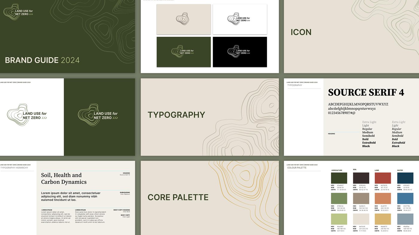
We developed a versatile logo that works effectively on its own, or combined with the Hub's full name and member organisations. This adaptability ensured consistent branding across various applications.
Steering away from generic corporate identity, the chosen colours reflect the Hub's core values. Greens and browns give a sense of nature and sustainability, while blues and reds suggest innovation and science. This approach aligned with the Hub's forward-thinking vision, mirroring the Soil Association website's use of colour.
We established clear guidelines for the Hub's visual identity, ensuring consistency across various communication materials, including their website, briefing notes, infographics, podcasts, and more.
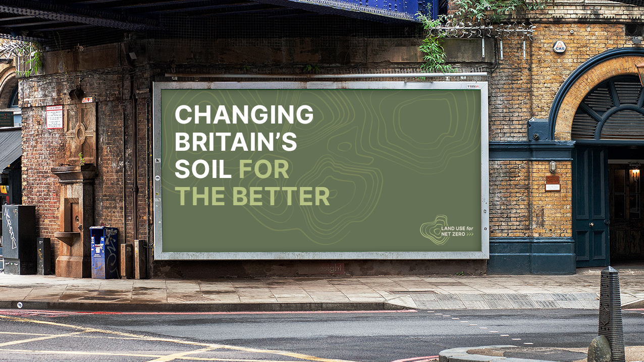
The Result